
The Best Accent Wall Colors for San Gabriel Valley Homes in 2026
If you want the short answer: muted green, warm neutral, soft terracotta, deep blue, warm earth tones, and charcoal are the top accent wall picks for SGV homes in 2026. The right one depends on sun direction, room use, and fixed finishes like wood trim, stucco, tile, and flooring.
Here’s the simple version:
- North-facing rooms: go warmer with terracotta, clay, taupe, or camel
- South-facing rooms: cooler or darker shades often hold up better, like deep blue, slate, or forest green
- East-facing rooms: softer mid-tone shades usually work well, like sage, eucalyptus, or warm greige
- West-facing rooms: lean earthy to soften strong late-day sun
A few fast takeaways from the article:
- Muted green is one of the safest 2026 picks for SGV homes
- Warm neutrals fit the most room types and often work well for resale
- Deep blue can add polish, and one 2025 Zillow study linked navy bedrooms to up to $1,815 more in sale value
- Dark colors like navy and charcoal need extra testing in low-light rooms
- Paint samples should be checked at 9:00 a.m., 2:00 p.m., and 8:00 p.m.
- A sample board around 2 × 2 feet gives a better read than a tiny chip
- For a stronger accent effect, many darker walls land around LRV 5 to 30
2026's Paint Color Shift | Warm Taupes, Deep Greens & More
sbb-itb-b9ba8eb
Quick Comparison
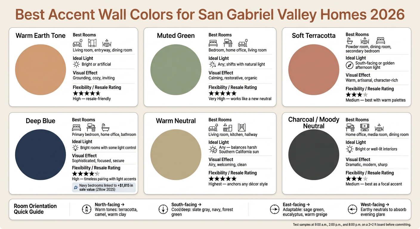
Best Accent Wall Colors for San Gabriel Valley Homes 2026
| Color | Best For | Works Best In | General Feel |
|---|---|---|---|
| Warm Earth Tone | Living rooms, dining rooms, entryways | Bright rooms, warm-lit spaces | Grounded and cozy |
| Muted Green | Bedrooms, offices, living rooms | Most light conditions | Calm and natural |
| Soft Terracotta | Dining rooms, powder rooms, bedrooms | Warm daylight, south-facing rooms | Warm and more color-forward |
| Deep Blue | Bedrooms, offices, dining rooms | South- and west-facing rooms | Polished and focused |
| Warm Neutral | Living rooms, bedrooms, hallways, offices | Almost any room | Soft and easy to live with |
| Charcoal | Offices, dining rooms, powder rooms, bedrooms | Bright rooms with some contrast | Moody and sharp |
Bottom line: if I wanted the safest starting point for a San Gabriel Valley home, I’d start with muted green or a warm neutral, then test it in the room over at least 72 hours before painting.
How to Choose an Accent Wall Color in San Gabriel Valley
In SGV homes, picking the right accent wall color usually comes down to three things: light, room use, and fixed finishes. Get those lined up, and even a bold shade can look right at home. Get one of them wrong, and the color can fall flat. That’s why these three checks help narrow your options fast.
Light comes first. South-facing rooms get strong, warm, golden light for most of the day, so cooler colors like slate gray or deeper shades like navy and forest green tend to keep their depth. The afternoon sun helps pull that color forward. North-facing rooms are a different story. They get cool, indirect, bluish light, so they often look better with warmer tones like warm beige, terracotta, or camel. East-facing rooms give you a bit more room to play with - sage green, eucalyptus, or warm greige usually work well. West-facing rooms start dim in the morning, then turn very warm at sunset, which is why earthy neutrals often make the most sense there.
Room use is the next filter. A home office usually feels more grounded with dark green, charcoal, or navy, and those colors also tend to look good on video calls. Living rooms and dining areas usually lean warmer, so earth tones or grounded neutrals are often a better fit.
Existing finishes narrow your options faster than anything else. Natural wood trim, which shows up a lot in SGV Craftsman homes, has a warm pull. Because of that, earth tones and clay neutrals usually feel like they belong there. It’s smart to choose paint after you’ve looked at the fixed finishes, especially in homes with wood trim, stucco, or terracotta tile. A simple way to test a color is to paint a 2×2-foot board and check it in the room at 9:00 a.m., 2:00 p.m., and 8:00 p.m.
The chart below turns those lighting rules into a quick room-orientation guide.
| Room Orientation | Light Quality | Best Accent Tone |
|---|---|---|
| North-facing | Cool, indirect, bluish | Warm: terracotta, camel, warm clay |
| South-facing | Intense, warm, golden all day | Cool or deep: slate gray, navy, forest green |
| East-facing | Warm mornings, cool afternoons | Adaptable: sage green, eucalyptus, warm greige |
| West-facing | Dim mornings, intensely warm evenings | Earthy neutrals that absorb evening glare |
1. Warm Earth Tone
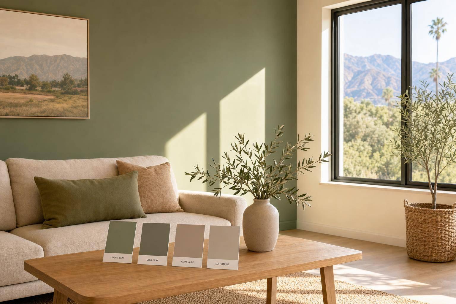
For rooms that get strong SGV sun, warm earth tones are a safe place to start. Shades like terracotta, warm taupe, sandy beige, and ochre hold up well in bright sunlight. They don’t wash out during the day, and at night they still feel warm and grounded. By evening, under warm artificial lighting, the color reads deeper and warmer.
These shades also fit many common SGV home styles. In Spanish Revival homes, terracotta and clay-based neutrals sit naturally next to white stucco walls and wrought-iron details. In Craftsman bungalows - especially in Pasadena neighborhoods like Bungalow Heaven - warm taupe and sandy beige work well with existing wood trim. And in mid-century homes in areas like Hastings Ranch, ochre or rust often pair nicely with oak floors, rattan furniture, and the indoor-outdoor feel those homes are known for. That’s a big part of why these colors make sense in homes with fixed wood, stucco, or tile finishes.
A simple way to use this palette is on a focal wall behind a sofa or bed.
Warm earth tones have broad appeal and help a room feel calm, warm, and welcoming.
2. Muted Green
Muted green is the best cooler swap for warm earth tones. In San Gabriel Valley homes, it works well because it reflects the local landscape and stays balanced in strong Southern California light.
The undertone matters a lot here. In bright Southern California sun - especially in south-facing rooms - green often looks stronger on the wall than it does on a paint chip. If the shade leans too yellow or too bright, it can start to feel loud or throw off glare. The safer move is a muted green with warm gray or brown undertones. Think Sherwin-Williams Evergreen Fog, Benjamin Moore October Mist, or Benjamin Moore Dry Sage. Those shades help the color stay soft instead of turning bright or childish.
Muted greens also play nicely with the finishes you already see in many SGV homes. Warm olive and sage sit well next to:
- wood trim
- cream stucco
- white oak
- travertine
- walnut
- warm brass
That mix feels natural, not forced.
When used as an accent wall, muted green tends to do its best work in spaces that need a calmer mood. A sage or olive wall can sit nicely behind a sofa in a living room, in a home office where deeper olive tones support focus, or behind the headboard in a bedroom for a calm, cocoon-like feel.
Muted greens also have broad buyer appeal, which helps an accent wall feel current without being too much.
3. Soft Terracotta
For homeowners who want a warmer, more expressive accent than sage, soft terracotta is the next strongest pick. If warm earth tones feel a bit too quiet, this shade gives you more color without giving up that warm feel. It’s the clay-rich step up from earth tones, and it works naturally with white stucco, wrought iron, and wood trim in many SGV homes.
In strong SGV light, terracotta tends to look richer during the day and cozier at night. That’s part of the appeal. The trick is to go with a muted shade, not a bright orange. Sherwin-Williams Redend Point has beige or pinkish undertones that help keep it grounded.
Test a large swatch before you commit. Terracotta often dries darker than it looks in the can. It tends to work best on an entry-view dining wall, a bedroom headboard wall, or a powder room in a color-drenched finish. Skip mostly windowed walls, where glare can wash the color out.
Soft terracotta also feels current in 2026, and it does a better job hiding light scuffs than pale shades.
4. Deep Blue
If warm earth tones and terracotta feel a bit too soft, deep blue brings contrast while still looking polished. In San Gabriel Valley's warm, sun-heavy climate, deep navy and indigo tend to work best in south- and west-facing rooms. The afternoon light shapes the color and brings out its depth instead of making it disappear. In north-facing rooms, though, these shades can look too dark or a little flat when daylight is limited.
One of the top navy picks for 2026 is Benjamin Moore's Hale Navy HC-154. To keep the look balanced, pair deep blue with warm white, brass, or light wood so the room doesn't feel cold.
In SGV homes, deep blue is a strong fit for 1920s Craftsman bungalows, especially homes like the ones in Pasadena's Bungalow Heaven. It works well with natural wood trim and built-ins, and the more controlled light in those spaces helps the color stay rich instead of heavy. That's why deep blue tends to shine in dining rooms, primary bedrooms, and libraries. It's best used on walls that are meant to stand out, not fade into the background.
For homeowners thinking about both style and resale, navy is one of the safer bold picks. Zillow's 2025 paint color analysis found that navy blue bedrooms can increase a home's sale value by up to $1,815. Navy also supports resale and reads as a lasting choice.
5. Warm Neutral
If muted green feels a bit too cool and soft terracotta feels a bit too bold, warm neutrals land right in the middle. They bring a soft, easy warmth that cool grays often miss in bright, dry light. That makes them one of the quietest and most flexible accent wall picks for SGV homes.
Room direction matters here. North-facing rooms usually do best with the warmest versions, like taupe or clay. West-facing rooms are a little trickier, because strong yellow undertones can start to look heavy by dusk.
For 2026, Sherwin-Williams' Color of the Year, Universal Khaki, stands out as a strong warm-neutral choice for SGV homes. Sherwin-Williams' Universal Khaki works especially well in SGV homes because its sandy undertones support wood trim, built-ins, stucco, and tile without competing with them. The result is a welcoming, finished look that doesn’t feel heavy.
Warm neutrals also connect well with buyers because they can make rooms feel larger and brighter - an edge in SGV markets like Arcadia, Alhambra, and Pasadena. They tend to work best in living rooms, bedrooms, and home offices. In open-plan layouts, using one steady warm neutral across connected spaces helps avoid the visual choppiness that can happen when high-contrast colors meet at doorways.
If you want a true accent wall effect, aim for a Light Reflectance Value (LRV) between 5 and 30. The comparison table below shows how this option stacks up against the bolder accent colors.
6. Charcoal or Moody Neutral
If warm neutrals feel a little too quiet, charcoal gives you more contrast without jumping all the way to black. In San Gabriel Valley, charcoal and other moody neutrals are a strong 2026 choice, especially as homeowners shift away from stark black and toward warmer charcoal and charcoal-espresso shades that feel softer and easier to live with. The big thing to watch is undertone. North-facing rooms usually do better with charcoals that lean warm or olive, while south-facing rooms can take deeper shades without looking flat.
These colors work especially well in Craftsman and mid-century homes. Wood trim and light flooring help sharpen the contrast, which keeps charcoal from feeling too heavy. In Spanish Revival homes, moody neutrals often work best as a focal accent on a fireplace wall or built-in surround instead of covering the whole room. That’s part of what makes charcoal so useful: it can feel very deliberate when you want the wall to stand out.
Charcoal accent walls tend to look best in:
- home offices
- dining rooms
- primary bedrooms
- powder bathrooms
In powder bathrooms, charcoal can feel rich and polished. Behind a bed, it adds a cocoon-like feel without taking over the room. For sheen, matte or eggshell helps cut glare. Satin can work in higher-traffic spaces, but it may show wall texture more easily.
Quick Comparison Table
Use this table for a fast side-by-side look at room fit, light, and how each color tends to feel in a space.
| Color Family | Best Room(s) | Ideal Light | Visual Effect | Flexibility |
|---|---|---|---|---|
| Warm Earth Tone | Living room, entryway, dining room | Bright or artificial | Grounding, cozy, inviting | High - resale-friendly |
| Muted Green | Bedroom, home office, living room | Any; shifts with natural light | Calming, restorative, organic | Very high - works like a new neutral |
| Soft Terracotta | Powder room, dining room, secondary bedroom | South-facing or golden afternoon light | Warm, artisanal, character-rich | Medium - best with warm palettes |
| Deep Blue | Primary bedroom, home office, bathroom | Bright rooms with some light control | Sophisticated, focused, secure | High - timeless pairing with light accents |
| Warm Neutral | Living room, kitchen, hallway | Any - balances harsh Southern California sun | Airy, welcoming, clean | Highest - anchors any décor style |
| Charcoal or Moody Neutral | Home office, media room, dining room | Bright or well-lit interiors | Dramatic, modern, sharp | Medium - best as a focal accent |
If you want the broadest fit in SGV homes, warm neutrals and muted greens tend to do the most work. They pair well with the area's home styles and drought-tolerant landscaping. Think of them as the easygoing picks: simple to live with, simple to style.
Deep blue and charcoal can look striking in the right spot, especially in home offices and rooms where you can manage the light a bit more carefully. That said, they need a little more planning around placement and contrast so the room doesn't feel too heavy.
For homeowners thinking about resale, warm neutrals are still the safest choice in markets like Arcadia, Temple City, and San Gabriel.
Next, match the best color to the room itself.
Best Accent Wall Colors by Room
Room use, size, and light should shape the final color choice. Once you’ve looked at light and finishes, the way the room is used is usually the fastest way to narrow down the right accent wall color.
Living rooms in open-concept SGV homes tend to work best with one focal wall in muted sage or warm neutrals like Sherwin-Williams' Universal Khaki. In open layouts, keep the accent to a single wall so the space feels pulled together, not chopped up.
Bedrooms give you a bit more room to go bold. Muted sage, soft terracotta, or deep blue behind the headboard can all work well. In enclosed bedrooms, using the same deep tone on the walls, trim, and ceiling can create a cocooning feel.
Dining rooms and home offices are strong spots for darker, moodier colors. Deep blue or charcoal in a dining room can make evening gatherings feel more intimate. In a home office, charcoal or muted sage on the main wall cuts visual noise and helps with focus.
Entryways do well with warm, inviting shades like terracotta, warm taupe, or Universal Khaki. Its earthy undertones help set a welcoming tone right from the start.
Use this quick room guide to narrow the best fit.
| Room | Best Accent Colors | Best Use |
|---|---|---|
| Living Room | Muted Sage, Universal Khaki | Single focal wall in open-concept layouts |
| Bedroom | Soft Terracotta, Deep Blue, Muted Sage | Behind headboard for a sanctuary feel |
| Dining Room | Deep Blue, Charcoal | Best in enclosed or formal spaces |
| Home Office | Charcoal, Muted Sage | Deep tones aid focus; strong video call backdrops |
| Entryway | Terracotta, Warm Taupe, Universal Khaki | Warm shades create a strong first impression |
How These Colors Fit San Gabriel Valley Home Styles
Room use helps narrow your options. But home style is what makes a color feel like it belongs.
In the San Gabriel Valley, accent colors tend to work best when they line up with a home's fixed materials and the way local daylight hits the room.
Spanish Revival homes usually look best with soft terracotta and clay tones. Those shades pick up the look of stucco and tile, so the match feels natural. And under strong SGV sun, warm colors like these hold their depth during the day and get moodier at night.
Ranch-style homes often pair nicely with muted green or warm neutrals on an accent wall, especially next to natural wood trim and walnut furniture.
Mid-century modern interiors can take stronger focal colors without feeling overdone. Muted green, deep blue, and warm earth tones tend to work well because they contrast with wood floors and brass hardware without making the space feel cold.
Updated contemporary interiors usually lean toward warm neutrals like Universal Khaki and charcoal. These shades fit crisp trim and clean lines well.
After you match the color to the home style, test it in the room's actual daylight before you paint.
When to Test Samples or Call a Local Painter
Once you’ve narrowed down your palette, do one last wall test before you buy full gallons. A color that looks perfect on a tiny paint chip can change a lot once it hits a full wall.
Paint at least a 12×12-inch swatch right on the wall, or paint a poster board and tape it up. Then check it after it dries in daylight and again at night. Test it on at least two different walls too. SGV’s bright daytime sun and warm evening light can make the same shade look different from one surface to the next.
That’s where people get tripped up. A color like terracotta or deep blue can look rich and moody at sunset, then feel flat in cool morning light. If the shade keeps changing too much from wall to wall, try a second option before you commit.
If you want an easier test, use peel-and-stick samples. They let you check color without the mess. And don’t rush the call - give yourself at least 72 hours before deciding.
It also helps to check the LRV on dark navy or charcoal shades. Low-reflectance colors can feel heavy in north-facing rooms. Dark, saturated shades are less forgiving than lighter ones too. They can show roller marks, uneven lines, and patchy coverage more easily.
If your sample brings out patching, texture problems, or uneven sheen, that’s a good place to stop and call in a painter. A local painter is a smart move for patched walls, niches, fireplace surrounds, or other detailed surfaces.
They can also help with prep work, coverage, and getting a cleaner finish on dark colors.
Conclusion
In San Gabriel Valley homes, the best accent wall colors need to work with strong daylight, warm finishes, and the way the room is used. In smaller rooms, lighter and warmer tones usually look better. Bigger rooms have more room for deeper shades. North-facing rooms tend to need warmth, while south-facing rooms can take on cooler contrast.
That’s why warm earth tones, muted greens, soft terracotta, deep blue, and charcoal stand out in 2026. These shades hold up well in strong SGV sun without glaring or looking washed out. They also pair naturally with stucco, wood trim, and terracotta tile found throughout the valley’s Craftsman, Spanish Revival, and ranch-style homes. Match the color to the room’s light, its fixed finishes, and how you use the space, and the right choice gets a lot easier.
FAQs
How do I pick the best accent wall if my room gets mixed light?
With mixed light, skip the guesswork and test physical swatches in the actual room. General rules can point you in the right direction, but they can't show you how a color will look on your walls. Paint at least a 12-by-12-inch sample and check it at different times of day, from noon to sunset.
When you pick an accent color, match its undertone to the room's fixed features, like flooring, cabinetry, and tile. If the light changes a lot during the day, a grounded, earth-inspired midtone tends to stay the steadiest.
Should my accent wall match my wood trim, tile, or flooring?
Not necessarily. Your accent wall doesn’t have to match your wood trim, tile, or flooring. But it should work well with them, not fight for attention.
A good place to start is with the undertones in your fixed finishes before you pick a paint color. For example, warm greiges and creams tend to suit oak floors, while cool blue-grays can clash with natural wood’s golden tones. If you’re not sure, test a large swatch next to your trim and flooring and look at it throughout the day.
What paint finish is best for a dark accent wall?
A matte finish is usually the best pick for a dark accent wall. It keeps the color rich and deep, without the glare that glossier paints can throw back into the room.
Eggshell can work well in living areas, and satin makes sense when you need more durability. But high-gloss is usually a poor fit for accent walls, especially with dark shades.