
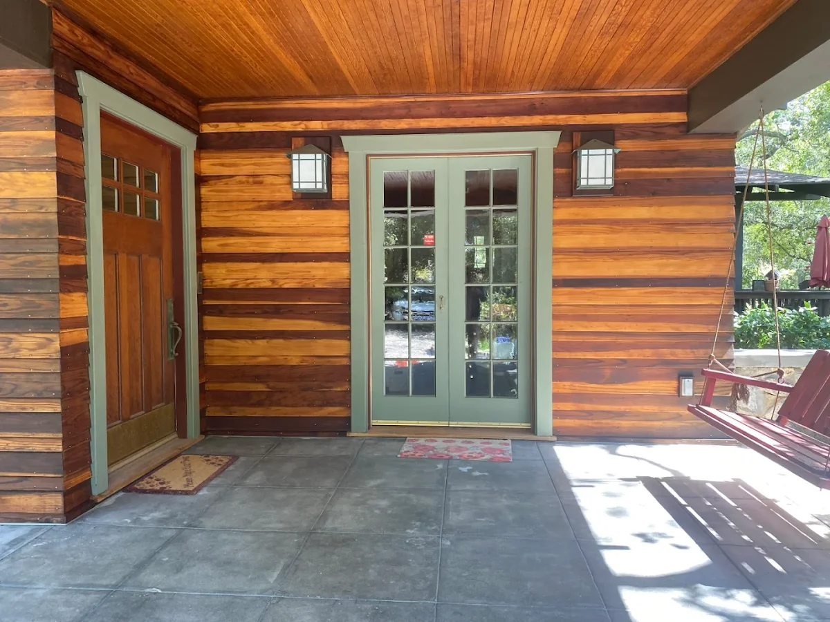
If you own a Craftsman home in Pasadena, the safest exterior plan is simple: use three colors, keep contrast clear, and prep old surfaces the right way. In strong Southern California sun, pale colors can look washed out, while mid-tone earth colors tend to hold their depth better. And with solid prep plus a high-grade exterior coating, a paint job may last 7 to 10 years.
Here’s the short version:
- Use 3 colors: body, trim, and accent
- Pick earth-based shades: greens, browns, taupes, muted golds, russets, and soft blue-grays
- Put color in the right places: body on siding or stucco, trim on windows/eaves/columns, accent on doors and small wood details
- Match fixed materials: stone, brick, and stained wood should guide the palette
- Protect old surfaces: wash, scrape, sand, prime, caulk open seams, and let surfaces dry fully
- Choose the right finish: low-sheen on siding, slightly higher sheen on doors and small trim
- Check problem spots early: sun-hit walls, fascia, trim joints, rot, and stucco cracks
- Best painting window: April through October
- Touch-up tip: use leftover paint within 6 months for a closer color match
I’d keep the look simple and period-friendly: a grounded body color, lighter or darker trim for separation, and one accent color to draw the eye to the front door and woodwork. The goal is not to make the house look new. It’s to keep the details sharp, the materials protected, and the home looking right from the street.
Craftsman Exterior Color Basics for Pasadena Homes
A Craftsman exterior usually looks best with three clear colors: body, trim, and accent. The body covers the largest areas. The trim outlines windows and edges. The accent draws attention to details like brackets, beams, and the front door. When each color has its own job, the house feels balanced and well planned.
Historically Appropriate Color Ranges and How They Read in Bright Sun
For Pasadena Craftsman homes, the best color families tend to be earthy greens, warm browns, muted golds, russets, taupes, and soft blue-grays. These shades also pair well with stone, brick, and stained wood.
Pasadena gets bright sun and dry heat for most of the year, so muted mid-tone colors are often the safer pick. They keep their depth better than pale shades, which can look flat or washed out in strong light. Clear contrast between the body, trim, and accent colors also helps the home's built-in detail stand out instead of fading into the background.
"In Sierra Madre and the wider San Gabriel Valley, exterior surfaces take a beating from year-round sun and dry heat, so the right prep and premium coatings matter as much as the color." - Huff Painting Co.
With those color families in mind, the next move is simple: decide where each one should go.
How Many Colors a Craftsman Home Usually Needs
Most Craftsman exteriors use three colors. In many cases, the front door works as the accent color unless the home's original details point to a separate highlight color.
It's also smart to match painted areas to the home's fixed materials. If the house has river-rock, clinker brick, or stained wood, pick tones that work with those finishes instead of fighting them. That split matters because the body, trim, eaves, and doors each do a different visual job. Once the palette is chosen, the next step is assigning each color to the right exterior features.
Where Each Color Goes: Siding, Trim, Eaves, Porch Details, and Doors
Good color placement helps historic details stand out instead of blending into one flat surface. Start with the body color first. Then use trim and accent colors to outline the parts that give the home its character.
Body Siding, Shingles, and Main Wall Surfaces
The body color covers the biggest area, so it sets the tone for the whole house. On lap siding, wood shingles, or stucco, a slightly deeper mid-tone usually works best in Pasadena’s bright sun. Very pale colors can wash out fast in strong light. A darker mid-tone tends to keep its shape and depth better, which helps the house feel grounded without hiding the detail.
Once the body color is in place, trim does the job of defining lines, edges, and depth.
Window Trim, Fascia, Eaves, Rafter Tails, and Porch Columns
Lighter trim makes edges look sharper and gives window frames and fascia boards a crisp look. Darker trim or eave accents draw the eye to the depth and weight of the woodwork. That contrast matters in bright sun, where porch and roofline details can fade from view, especially on homes with prominent rafter tails.
Porch columns usually look best when they stay tied to the trim color. That way, the entry feels like one connected element instead of a mix of separate parts.
Front Doors and Small Accents That Add Contrast Without Looking Modern
The front door is the last accent in the scheme. Use the accent color on the door, decorative brackets, rafter tails, and porch details to add contrast and pull attention to the home’s craftsmanship without taking over the facade.
With color placement set, the next step is matching those roles to durable palette combinations and breathable coatings.
Palette Options and Repainting Basics for Pasadena Craftsman Homes
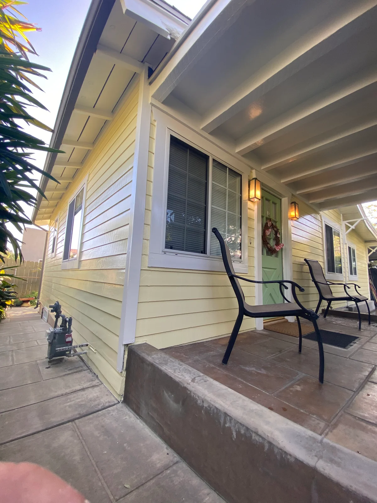
Palette 1: Earth Green Body, Warm Cream Trim, and Deep Brown Accents
This palette works well on homes with natural wood details, river rock foundations, or darker roof tones. A muted sage or olive green body color feels settled under Pasadena's strong afternoon light. Warm cream trim keeps window frames, fascia boards, and porch columns clear and easy to see. Deep brown on brackets, rafter tails, and porch details connects the paint scheme back to the home's natural materials.
Palette 2: Taupe or Muted Gold Body, Soft Brown Trim, and Blue-Gray or Olive Accents
Use this palette when you want warmth without sharp contrast. A taupe or muted gold body stays neutral in direct sun. Soft brown trim helps porch columns and shingle bands stand out without looking harsh. A blue-gray or olive accent on the door and small decorative details adds just enough contrast to draw attention to the craftsmanship.
Once the colors are chosen, the coating system and surface prep make a big difference in how long that look lasts.
Prep Work and Breathable Coatings for Older Wood, Stucco, and Mixed Materials
After the palette is set, surface prep plays a big role in the life of the finish. On older Craftsman exteriors, start with washing, then move to scraping, sanding, priming, and caulking open seams to help block moisture. Let every surface dry fully before priming. If moisture gets trapped, peeling can show up early.
For stucco, use a breathable, flexible coating system that can handle hairline cracking and allow moisture to escape. For wood siding and shingles, use a premium UV-resistant exterior coating to help the color hold longer. Keep the finish thin enough so the wood grain, brackets, and trim profiles still show. Heavy buildup can blur the crisp lines and texture that give a Craftsman exterior its character.
If the exterior also needs stucco repair, wood restoration, or lead-safe preparation, take care of that work before the finish coats go on.
Protecting the Finish: Sun, Moisture, Sheen Levels, and Long-Term Maintenance
Once you’ve picked the color and coating, the next job is making that finish last. On a Craftsman exterior, that comes down to sun, moisture, and steady upkeep. Even a well-coated home needs regular check-ins because Pasadena sun and dry heat can wear finishes down fast. A good coating helps slow that wear, but routine inspection is what keeps small issues from turning into early failure.
To help the finish reach its full lifespan, plan painting projects between April and October, when drying conditions are the most reliable.
Finish Selection and Inspection Points That Prevent Repainting Problems
For a finish that lasts and still looks right on a Craftsman home, choose sheen levels that protect the surface without making the details look washed out. Low-sheen or flat finishes on body siding and shingles usually do a better job of keeping the historic look than glossy paint. Save higher-sheen finishes for doors and small trim details.
For the coating itself, pick UV-resistant exterior products that help color stay steady in Pasadena sun. Lines like Sherwin-Williams Duration, Sherwin-Williams SuperPaint, and Dunn-Edwards Evershield fit the local climate well because they offer strong color retention and help resist fading.
Before repainting, inspect:
- Sun-facing walls
- Trim joints
- Fascia
- Any signs of wood rot
- Any stucco cracking
Finding those problems early can stop a minor repair from snowballing into a full repaint.
Use leftover paint within six months for touch-ups so the color still matches. Keep it tightly sealed in a cool, dry place, and stir it well before you use it again.
FAQs
How do I test paint colors in Pasadena sun?
Apply sample swatches to different sides of your home, then check them at a few points during the day. Look at each one in direct sun and shade so you can see how Pasadena’s strong light shifts the color.
The hot, dry San Gabriel Valley climate and heavy UV exposure can change how paint looks and how long it holds up. That’s why it helps to go with high-quality, UV-resistant coatings from brands like Sherwin-Williams or Dunn-Edwards for better color retention.
When should I repair wood rot or stucco cracks?
Repair wood rot and stucco cracks before you apply new paint. This step belongs in surface prep because paint lasts longer when it goes on a solid, stable base.
Fixing those problems first also helps protect your home’s structure and keeps the exterior looking good.
What if my home has brick, stone, and stained wood?
If your Craftsman home has brick, stone, and stained wood, go for a unified look that works with those natural textures instead of fighting them. Keep stained wood sealed to help guard against weathering. And in most cases, leave brick and stone as they are so the home keeps its historic character.
For siding and trim, choose colors that pair well with those earthy materials. Shades that pick up the undertones in the brick or stone can pull the whole exterior together and help details stand out.
More guides
- Low-VOC vs Zero-VOC Paint: What Homeowners Need to Know
- Painting Your Home Before Selling: What to Paint and What to Skip
- Professional vs DIY Painting: A Realistic Cost Comparison
- Repainting an Altadena Home After the Eaton Fire: Smoke Sealing, Primers, and Realistic Timelines
- Smoke Damage Painting After the Eaton Fire
Related painting services
If this article covers something you are planning, these pages go into what the work actually involves on a job.
- Interior painting for walls, ceilings, trim, and cabinets, including how we mask and protect a house you are still living in.
- Single family home painting for a whole house inside or out, from the first walkthrough to the final punch list.
- Apartment building painting for owners and property managers with occupied units and common areas that have to keep working.
- Painting in Pasadena and the rest of the San Gabriel Valley, with the local prep, permit, and historic district notes that apply there.